
To Frame, Not to Frame, How To Frame, Where To Frame
Framing questions are some of the most frequently asked questions that we artists get, and it’s no wonder why. A frame can really set a piece off, make it shine, be distracting, be totally necessary, or completely unnecessary! Here are a few suggestions on the hows, ifs, where and whys of framing your art.
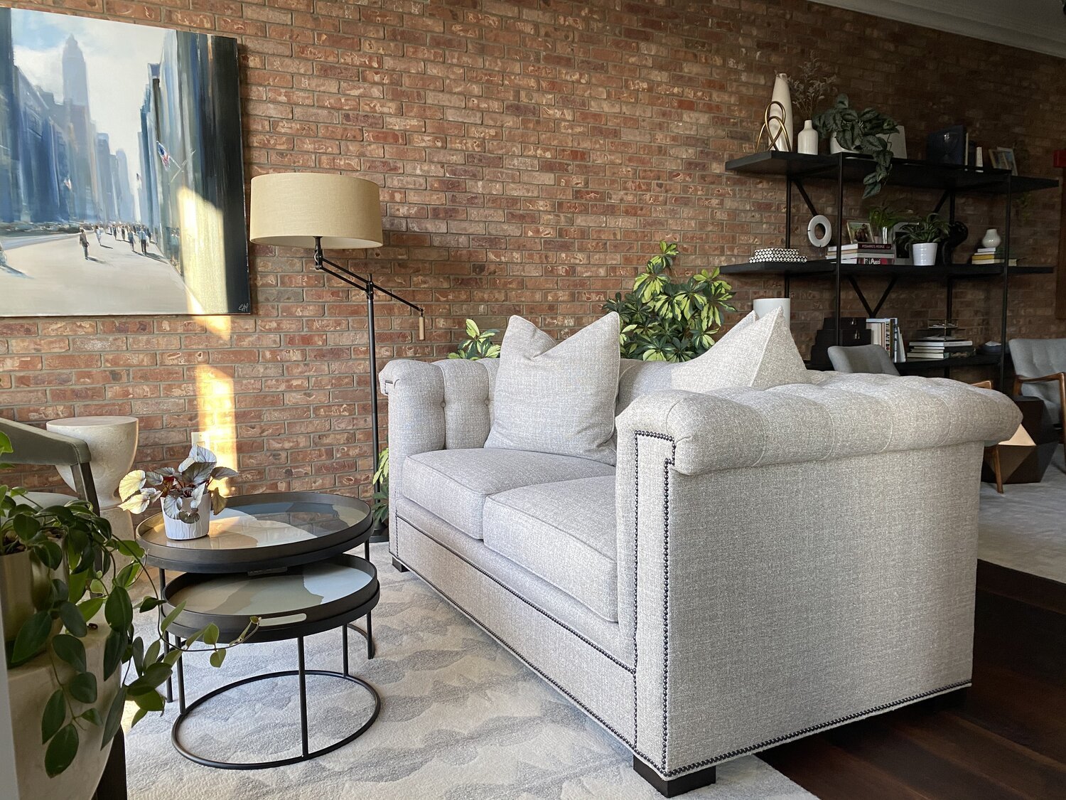
Art by Theresa Roche, collection of Lauren Bolshakov. Photo by Amanda Anderson
PAPER?
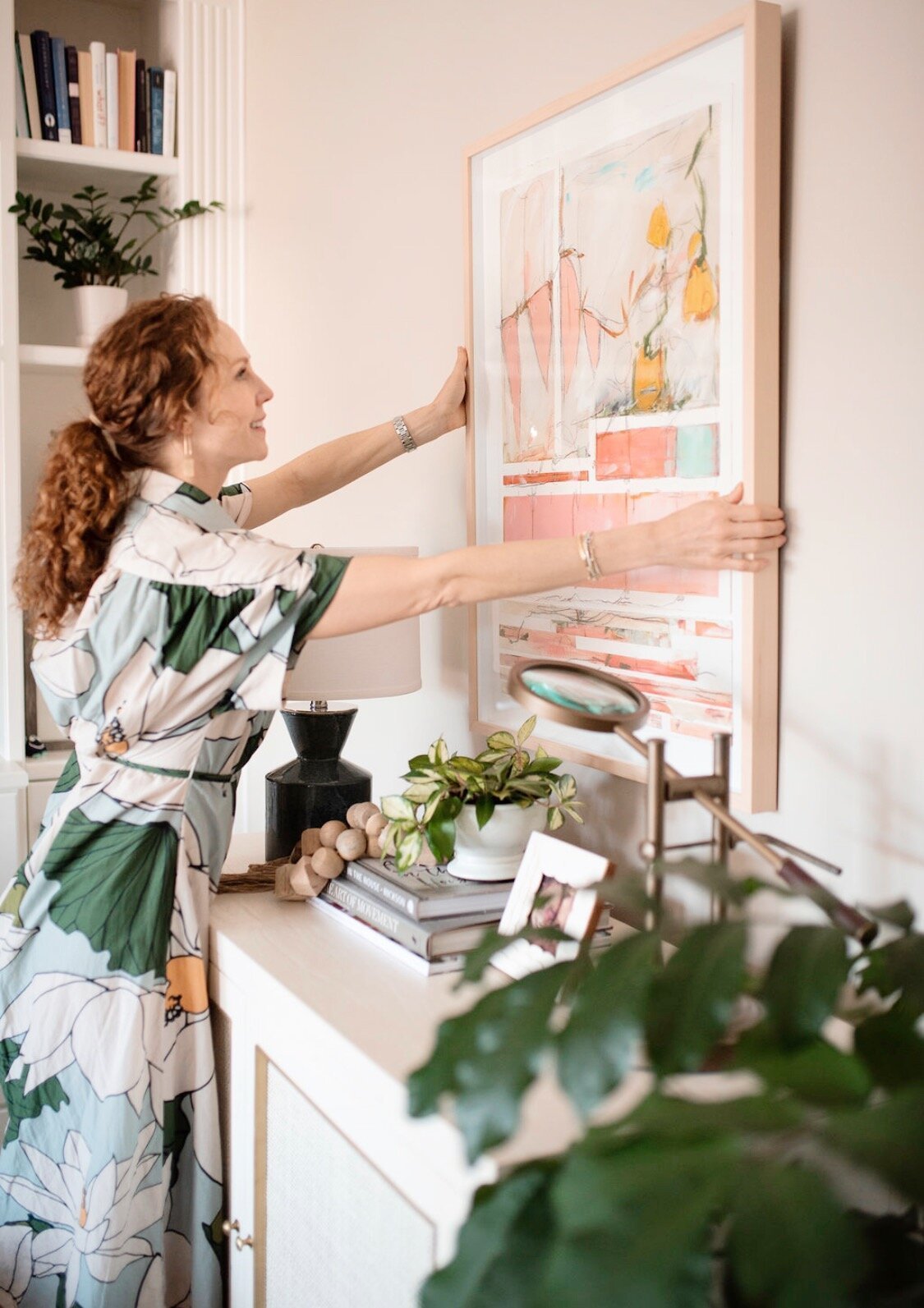
Yes, always frame. I usually opt for floating the painting over the mat if the edges are deckled and you want to show them off, otherwise, I go for regular matting. There are a LOT of options in mat and frame combinations, but I generally keep it simple with white matting. I love an antique gold frame on modern abstracts and nudes, I love an oversized mat on a small piece, but most of all I love when the frame and art work together to make a statement. Framing your paper piece will protect it, keep it safe from dust and some can even help protect against UV rays! I use a local framer for most of my works on paper, but I’ve also framed work in these maple beauties and these metal ones. Another very good and cost effective option is using a framing service like Framebridge.

CANVAS?
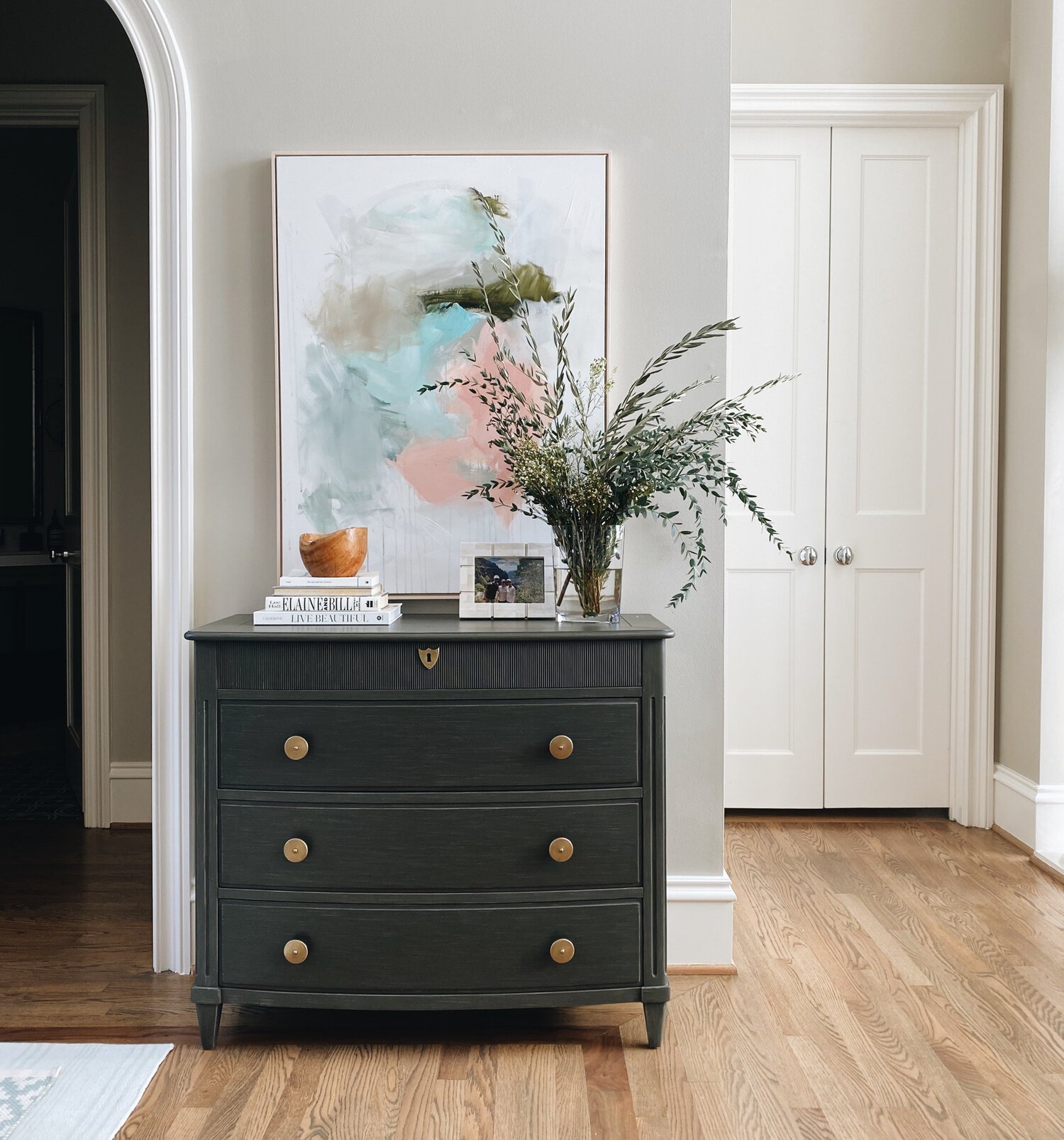
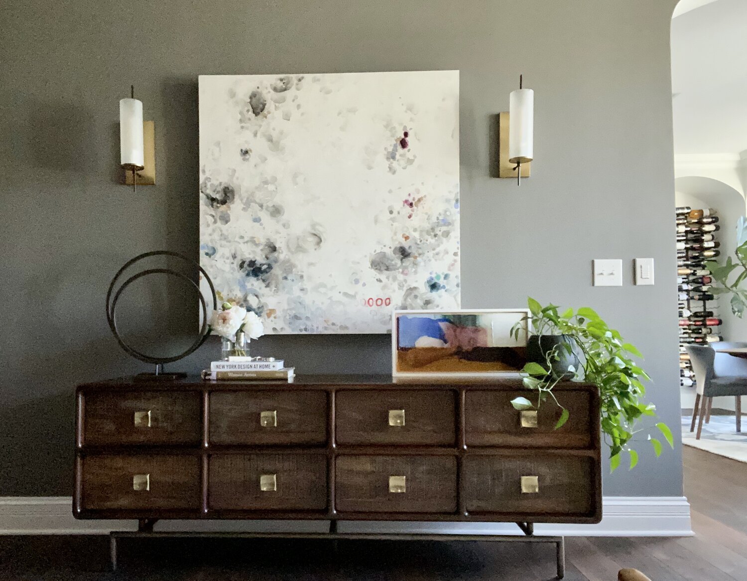
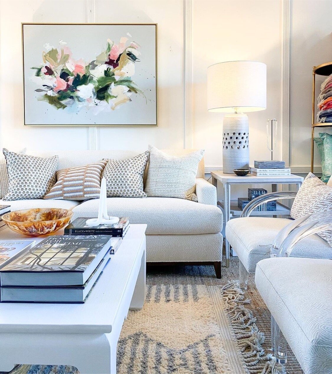
Yes…. or no. Most art on canvas or panel will be finished in a way that framing is optional. I usually let the room and the work itself guide me.
A couple of rules of thumb that I use are: If there are other framed pieces already hung in the same room, I’ll don’t feel like I need a frame. When I do decide to frame canvas pieces, I’ll opt for a floater frame. I never try and match a frame to a piece of furniture that it’s hanging over or to the other frames in the room.
Art by Casey Matthews and J. Loius
Art by Lauren Bolshakov at Isabella Style

Art by Craig Mooney
Gold and maple are my go to frame colors, but again, this is personal preference. Sometimes if a piece has a lot of white, negative space background, I think a white floater frame can really set it off, and I usually always frame thin profiled canvas in a floater frame. I almost always frame small art, so that there is the option to hang it or for it to be able to be placed on a table or in a bookshelf without falling over.